Before I was a web professional, before all the project management, front-end coding, and CMS rejiggering, I was an English major. My BA is in writing and, as such, I tend to approach most things I do from the stance of an author.
That being said, the Author User Experience (AUX) of WordPress has been on my mind for a while now. To me, regardless of use, WordPress is about sharing content: articles, images, audio, video. Specifically, WordPress is all about words. It’s right in the name and everything!
When I look at the WordPress admin as it stands now, I see so many amazing author tools. But I only see them because I know where to look—I have been using the tool since 2007 (WP 2.1 - Ella) and have watched it grow.
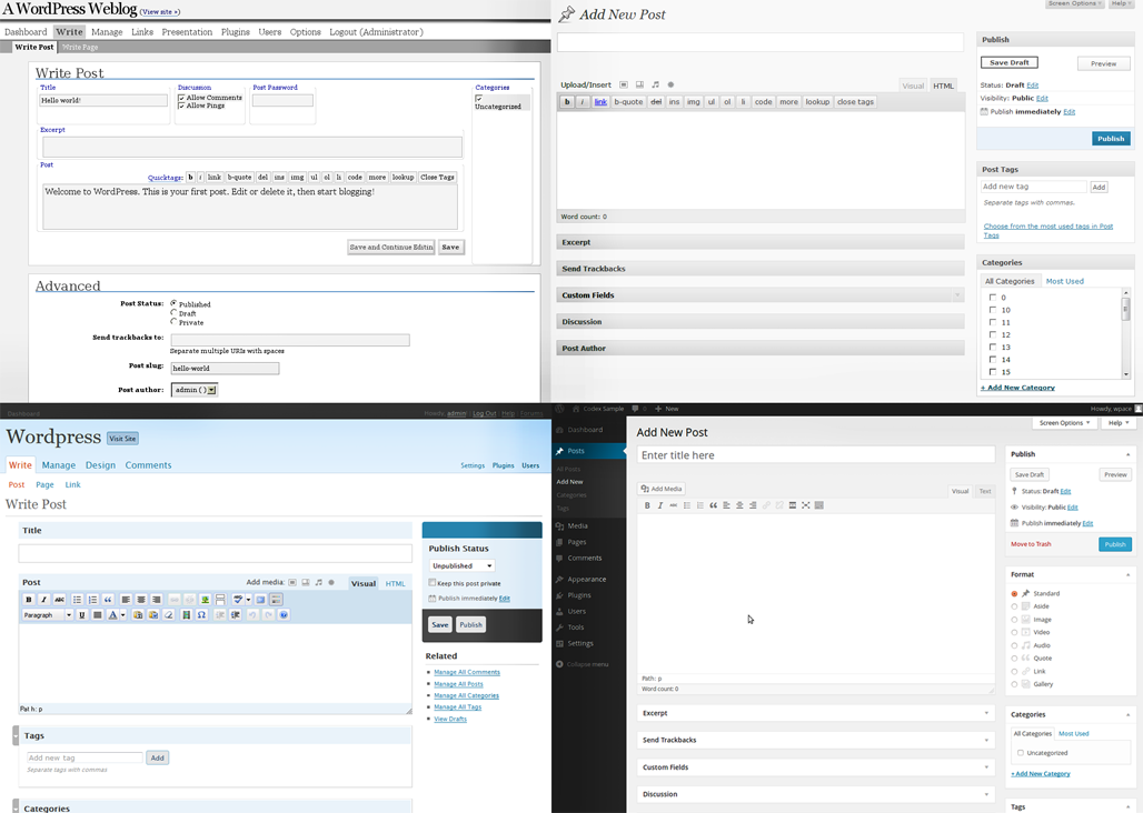
But familiarity or not, the WordPress authoring experience leaves much to be desired. In fact, I never write new content directly in the WP admin. Rather, I compose my drafts in some outside word processing application (typically Google Docs, but I’ve often just typed out posts in a plain text editor like Notepad or TextEdit). I never thought much of it, but the question must be asked: why do I do this? The obvious answer is because the writing experience inside of WordPress is disruptively jostling, but what specifically is breaking my authoring flow?
For this exploration of the WP AUX, I’m willfully ignoring my I-am-a-web-professional knowledge base and am reviewing the WordPress admin from the stance of a writer of words. I full well know that many of my suggestions run counter to technical hurdles and rationale, but luckily, since I don’t do back-end coding, I can let my suggestions run unfettered by such pesky restrictions as project lineage, technical practicality, or general reality.
Impediments in the WordPress writing experience
The Title
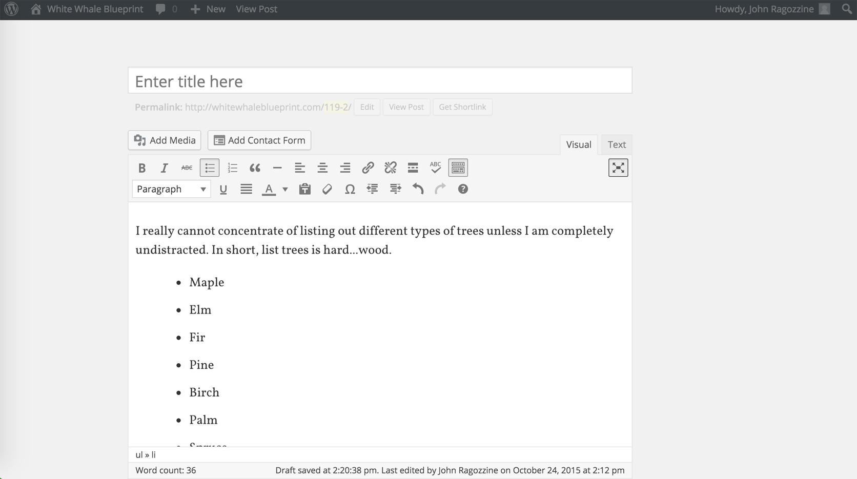
For WordPress authors, the writing experience begins on the Add New Post screen. The very first visual ask of the page is Enter title here. Most authors would agree that the title is the last thing to coalesce during the writing experience. Yet here, it is the first request being made.
So perhaps an author enters a placeholder title for the time being. Once a WP post has a title, the system autosaves the draft and uses the title as a slug to create the permalink. The permalink is the URL of the as-of-yet published article (I won’t get into the fact that all fresh WordPress installs do not have permalinks set as the URL structure by default, which is a continually surprising thing. SEO may be a bit of smoke and mirrors at times, but having informative, human-readable URLs is a must.)
And as jarring as that might be, if you have entered a misspelled word into the title field, there is no red squiggly signifier of your error. Instead, a permalink is generated with the typo for all to see.
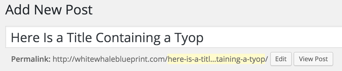
What’s great here is that WordPress does allow you to edit the slug, or will automatically generate a new one if the title is changed and re-saved, but it’s still a distraction to the writing process, placing many choices and interactions ahead of the author just typing out their thoughts.
Now, authors could ignore the title field to start (my weirdo brain has trouble doing so), but again, this is WordPress is asking writers to immediately step out of the writing process and actively overlook the (assumed) desired workflow.
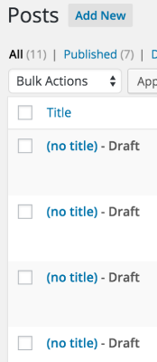
Plus, even if you gracefully ignore the title field, once the untitled post is saved, it is given a temporary URL, like www.yoursitename.com/113-98, that does not clue you in on the post’s topic. It’s also pretty ugly to see that advertised just above the writing window. And if you step away from writing and try to come back to this later via the All Posts screen, the presentation of untitled posts is: (no title) - Draft. I typically have a few articles in the creation hopper, so this lack of identifier is troubling and will require a few clicks to find the sought after draft.
Now, let’s leave the title behind us and move on to the actual writing experience.
The WYSIWYG
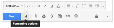
The WYSIWYG (What You See Is What You Get) is the field to enter all of your article’s content. There are a LOT of controls here. Buttons for adding Media, toggles between the Visual mode and the TEXT mode (being a recovering coder, I prefer the latter), and oodles of formatting options. Again, this is all visual noise standing between the author and their writing. It would be great if all of these things could be hidden or minimized to a single button, similar to how Gmail handles their beneath-the-writing-pane text formatting toolbar.
The writing field itself is so dinky in WordPress. It’s jammed between the left navigation and the right column of metaboxes for various tasks. I find the actual space for writing my posts within WordPress as too narrow. It’s treated just like any other metabox on the page and feels less like an opportunity to express oneself as a form field on the DMV’s website.
WordPress provides an author two options to counter this Orwellian writing experience: Distraction-free Mode and Screen Options.
To start with the latter, one could use the Screen Options tab to scale down to a single column, but in my experience, most new users don’t even notice the control at the top right of the admin screen. And if you do go this route, any other functionality you may want (like Save) is absolutely buried beneath the writing field. Yes, one can drag-and-drop metaboxes amongst themselves, but not above the writing pane. No mixing!
Distraction-free mode is WordPress’s attempt to dismiss all that visual flotsam and let the author just write. And yes, it makes a good deal of stuff disappear from view, but the writing pane itself does not grow at all. It just stays the same, like it’s saving the place of the left nav. It’s just left stranded slightly off-center in a field of beige-y gray.
I’d love to see the screen space dedicated to writing (remember, this is the admin page for writing) to be maximized as much as possible. As mentioned earlier, hiding the formatting tool is a good first step, but let’s use that screen real estate. Let go of the textbox look and feel and, instead, inspire authors to create by giving them a canvas that looks the part.
People have played around with this concept quite a bit, hacking WordPress via seemingly abandoned plugins or [visually on Dribbble]https://dribbble.com/search?q=wordpress+admin, but I find much of these to be overly styled. Perhaps it’s my aesthetic, or just my focus on a straightforward writing experience, but I feel a simple yet absorbing writing experience is what WordPress deserves.
The Excerpt
Steeped in WordPress’s blogging heritage (and immortalized in its code), an excerpt is often used on front-end index pages in lieu of displaying the full post content. If not provided, yet called by the WordPress theme in use, the first 55 words of the post are extracted and displayed in its stead.
The idea behind the Excerpt is to provide a teaser of the article’s full content. But the nomenclature is very clinical—almost sterile. The way I think about teasers (and publishing professionals think about deks is something to tantalize the reader while simultaneously building their expectations about the content. It’s the what and the why moment: What is this article about and Why should I read it?
Screen placement aside (as covered above, you can’t get this metafield above the main content field without coding), semantics matter. I’d love to see the presentation of this field move beyond the default descriptor of optional hand-crafted summaries of your content. Booor-ring. This is the marketing moment and could be spruced up to be an Elevator Pitch or even the Hypothesis of the article for the scientifically-minded among us. AUX is more that the visual; it’s about finding the right placement and workflows to engage authors in the writing process.
In short, words matter.
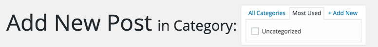
Content is only as good as the taxonomies we place upon it. When we search and do research, we’re diving into specific topics. Taxonomic terms (the categories and the tags we apply to our content), helps a reader find what they want.
Any WordPress professional has tried to explain the difference between categories and tags to non-technical authors. Why not cut this conversation off at the start and prompt authors for taxonomies in a differing way.
With categories, I can a more deliberate engagement of the AUX by building a prompt right into the admin’s navigational layout. Historically, blog themes have used language like Filed in for categories, which connotes an archival placement. So rather than shove the Category metabox off to the side or way down the page, tap into the mental process of the author as creator and lead with it.
With tags, the WordPress admin is much for freeform, which I like. Tags are just no pressure and presented as such. And while we could retread the aforementioned screen-placement-of-the-metabox line of critique, let’s instead think about how we tag our content.
Right now, it’s a manual process. Instead, the CMS could do scans of the post’s content and, when a term either jibes with a previously used tag or is used so often in the post as to reach critical taxonomic mass, a tag could be added automatically to a list, ready to be culled or edited by the author once the writing process reaches that point.
What’s more, this automated tagging could support adding variations on a term as well. Your excellent post about your cat could generate the tag cat. But this smart system would also create the plural cats, the scientific feline, and maybe the extrapolation pet. (It’s your imagination’s call if a crazy cat lady comes to mind).
There are a bunch of plugins that attempt this functionality, but having tested none of them, here they are in order of Still Being Paid Attention to by the Plugin Author:
Whether making it more deliberate or propped up by the CMS, WordPress taxonomies can be rethought to make authors’ experiences more focused on the writing.
This is the one that really grinds my gears. There an author is, composing content to their muse’s delight. They’ve revised, re-thunk, categories, tagged, and achieved that magical moment when they can say to themselves, “Yes, this is ready for the assumedly existing audience of my site. Let’s publish!
So what does an author do now, once they reach the final step in the WordPress AUX? To publish their article, they scroll all the way to the top of the screen again to reach the Publish metabox. I’m no above the fold proselytizer or anything—far from it—but when we’re dealing with a user journey such as this, to force a complete about-face in the final step just feels wrong.
Make the Publish metabox’s layout horizontal and have it stick to the top (or bottom) of the screen as an author scrolls their way down through their article content. For added jazz, the post title could also display in the sticky Publish bar, as could myriad other helpful icons that trigger dropdown menus of functionality.
This is an easy win for WordPress and for the authors who use it.